The Houston Model ©

<< Back Home                                             Created : Aug 30, 2006
       Having established there is a Gigantic Housing Bubble in the United States.

       The next question is, How much is this Over Valuation?

       Is there a way to get some numbers on this Over Valuation?

       Sure we can make an attempt.

       And we just have to go as far as Houston to do it.

       Houston has shown remarkable sanity in it's Housing Market, despite what
   has been happening Nationally.

       Houston and Dallas, the two Major Metro Areas of population over 5 million,
   have had appreciation rates of under 5 percent, despite the double digit rates
   nationally.

       Why is Houston so much behind the National Trend?

       The National Housing Bubble started in 1965 and was expanding. Then came the
   Oil Boom in early 80's. Houstonians suddenly had a lot a of money coming their way.
   And this money went further into speculating in the Houston Housing Market.

       Houston partied during the Oil Boom in the early eighties. Houston had it's
   peak during the 1981-1983 period. Appreciation got ahead of Inflation, and also
   the National Housing Bubble.

       Then came the bust. Prices fell sharply during the 1983-1988 period. Houston
   tripped and fell out of the National Bubble early on.

       It took 15 years, until 1997 for prices to recover and reach the 1981 level
   again.

       The Oil Rich Lone Star State learnt it's lesson. Houstonians learnt not to play
  the real estate market again. That has kept home prices sane in Houston, and driven
  speculators away.
|
|
|
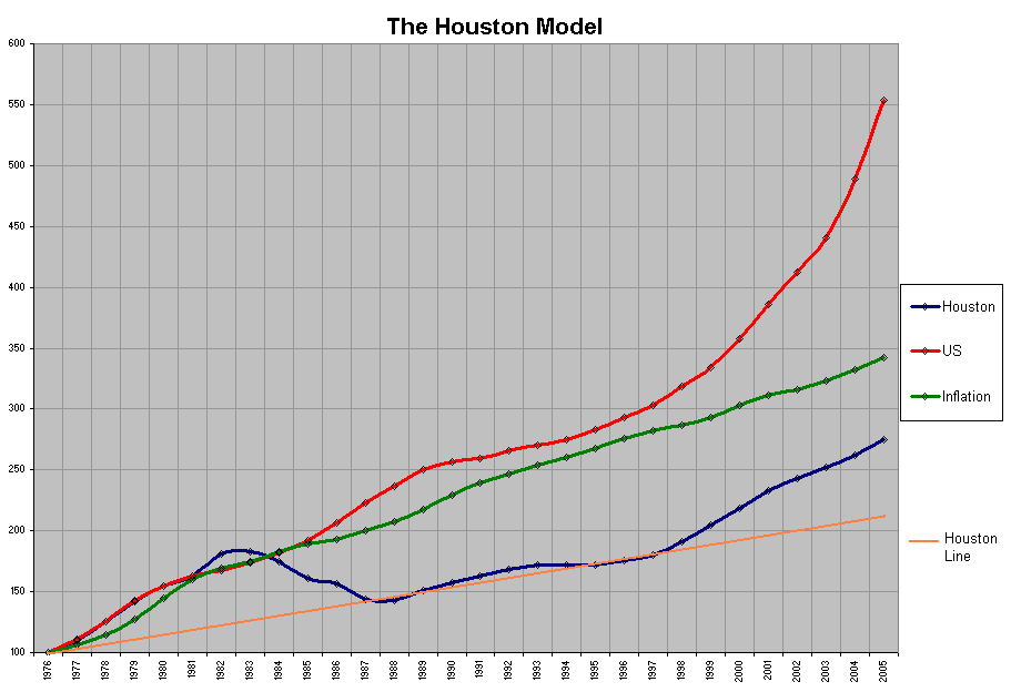
         (The Graph starts at an assumed HPI of 100 in 1976 for all.)

        The rest of country has continued to play in the National Housing Bubble without
     getting burnt seriously (until now), and prices have continued to rise much faster
     than inflation outside Texas.

        Looking at what happenned in Houston and Texas, we can get a preview of what is
     coming our way next.

        We will examine closely what happenned in Houston, calling it the Houston Model©
     from now. And see what we can find using it.

         To get started, I have plotted above, a graph of OFHEO HPI's for Houston and the
     US, and also a green line for the Inflation Adjusted Value of $100.

         The HPI values for Houston and Most Other Major Metros are available starting
     only from 1976. We will get to them later.

        This graph shows the peak and the bust. Houston shows near ideal appreciation
    from 1987 to 1997, for a good Ten Years after the bust.

        This allows us to draw what is the Houston Line on the graph.

        Since, 1997 it also appears that the National Housing Bubble has started to
    reinject some froth in Houston. And there has been a significant deviation from the
    Houston line.

        There is also no clear way to get a reading on the froth for the 1987-1997
    period. Though the National Bubble had kept expanding during that period. So we
    will leave it in there.

        We would rather understimate the overvaluation, than to overestimate it.

        Houston's Graph in 2005 is at 274.61

        Houston Line meets 2005 at 216.36

        In the Houston Model © we will use these two numbers to calculate a range
    of overvaluation for other Metro Areas.
                                                                     NEXT >>

   Legal Disclaimer : This is NOT Investment Advice, and should not be construed
                   so. This is for entertainment and informational purposes only.
|
 ______________________________________________________________________________

Copyright © 2005 by Author. This material may be distributed only subject
to the terms and conditions set forth in the Open Publication License.